1
Seals on bedsheets
A detailed seal may look official on paper, but it usually disappears on a waving flag.
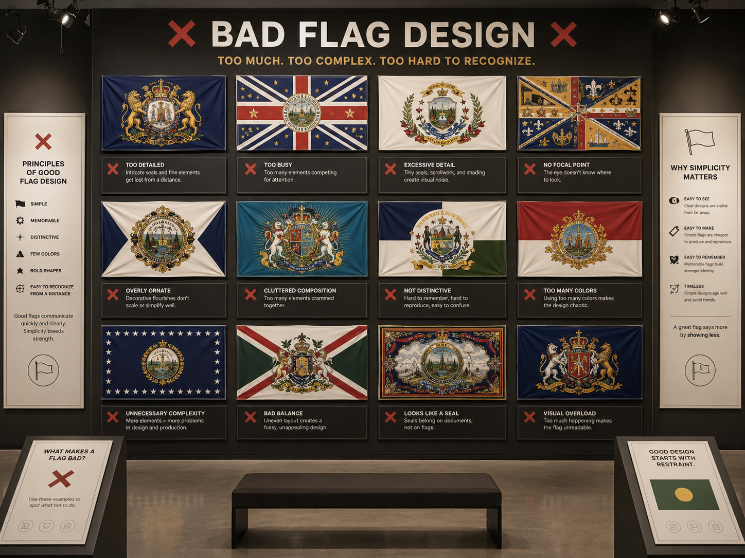
Bad flag design happens when a flag tries to be a brochure, a legal document, a city seal, a landscape painting, and a history textbook all at once. A flag must work in wind, at distance, in motion, and sometimes at night.
The core mistake
A bad flag usually fails because it forgets the conditions of use. Flags fold, flap, wrap around poles, shrink to icons, hang in poor light, and need to be recognized quickly.
If a flag only works when perfectly flat, close-up, and explained in a paragraph, it probably is not doing the job of a flag.
Common mistakes
A flag should be simple enough to remember, bold enough to recognize, and meaningful enough to matter. When designers add too much, the flag often becomes less meaningful, not more.
A detailed seal may look official on paper, but it usually disappears on a waving flag.
If the flag needs small text to explain itself, the design is probably too weak.
Trying to include everything often makes the flag remember nothing clearly.
Colors that blend together may fail outdoors, in shade, at distance, or at night.
A flag needs a strong palette. Too many colors can make it look busy and weak.
A flag should give people one strong thing to remember: a shape, color, symbol, or idea.
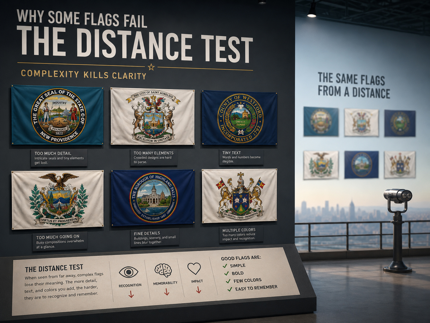
The distance test
A flag is not a flat graphic on a screen. It lives in weather. The design must survive motion, folds, shadow, sunlight, distance, and night lighting.
A good flag can be recognized when small, moving, partly folded, and seen from far away. A bad flag becomes a blur, a blob, or a mystery.
SolarFlag.com
Great flags are simple, memorable, meaningful, and visible. Bad flags hide their meaning inside clutter. If a flag flies at night, lighting matters too — because even a good design disappears in darkness.